
Project Vision
This project aimed to reimagine the console's account registration process.
Objectives
-
Eliminate frustrations with creating a PlayStation account.
-
Design a "sign up" interface that's both accessible and user-friendly.
-
Simplify registration and remove unnecessary verbiage and language.
-
Write concise copy with clear directions for the user to follow.
-
Get people new accounts and back on the game as quickly as possible.


Breakdown
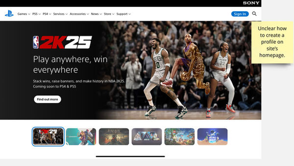
The site's feature to create a new account is buried underneath various pages and prompts. Due to its design, the brand sends the wrong message to new players that their presence isn't valued.


Insights
Interviews revealed that the account sign-up process was tedious and long. After becoming frustrated with both locating the sign up prompt and then attempting the process, users exit the site. I came up with a new process that would save time and potential new accounts.
User Journey Map
-
Using a user mapping journey, I discussed the difference between Sony's existing user function and the new registration process.
-
In the user research stage of the project I spoke with gamers who have attempted to create new accounts, gathering testimonials from them regarding their experiences.
-
This information informed the user map before and after the UI changes. The research also yielded four pain points of Sony's current registration design, found below.

User Profile
While 5 users were involved with the study, here is one that stood out.

Competitive Audit
A competitive audit was completed on Sony's competitors. The objective was to look at how the competition positioned their account sign up/sign in buttons to deduce what the gaming industry's best practices were. Here is what was gathered from each of Sony's direct competition.

Microsoft: Microsoft's homepage features a link to sign up for its homepage. However, players are greeted to both an option to sign in or sign up on the next screen. The design immediately pulls in players and reassures new gamers that they are welcome at XBox.
Nintendo: Nintendo includes the link to their account registration on their homepage. The link includes an option to sign up if gamers still need an account. Nintendo's UX design emphasizes the inclusion of new and returning players alike.


Steam: Steam, Sony's competitor in the PC market, also features its login on the homepage. But this brand uses poor UX as the next screen only allows gamers to log in or click a prompt that says "Help, I can't sign in." There isn't an explicit button that allows the user to "sign up" and get started on their new Steam account. It seems that Sony and Steam are in the same boat.


Begin the adventure
Utilizing the user map, I constructed wireframes and prototypes to detail the journey of the user.


Paper wireframes of suggested homepage and sleeker sign up page.


Here are the Lofi prototypes before and after implementing the user suggestion of adding Google email and a back button.
Before

After


Iteration
I iterated on the initial paper wireframe designs, seeking answers to the objectives stated earlier in the project. I asked those questions during the usability study portion of the project, conducting interviews with fiver people. I then implemented their feedback throughout the design process. I.e Google email prompt, back button, and separation of sign in/sign up buttons.

Hi-Fi Prototype
Here is the Hi-Fi Prototype in all its glory with the proper connections and flow start.

Key Takeaways
My peers stated that my redesign made the sign up process “easier than Sony’s.” Additionally, my peers insisted that I use this for my case study because it “recognizes an obvious fix.”
I learned to make sure I put accessibility standards at the forefront of my mind when designing, researching and writing. Marginalized communities go overlooked far too often in UX.

Link to Working Hifi Prototype here.


